REQUEST AN ESTIMATE TODAY! CONTACT
GALLERY
MY ACCOUNT



If you're mapping out a kitchen update, it's time to look past the cool grays of yesterday and welcome the inviting warmth of today's top trends. We're talking about mushroom, taupe, greige, and creamy off-whites—colors that feel both fresh and timeless.
For years, cool grays and stark whites were the go-to for a clean, minimalist kitchen. But a major shift is happening. Homeowners are now craving spaces that feel like a sanctuary—grounded, cozy, and restorative. That desire for comfort is directly shaping the kitchen cabinet color trends we’re seeing everywhere.
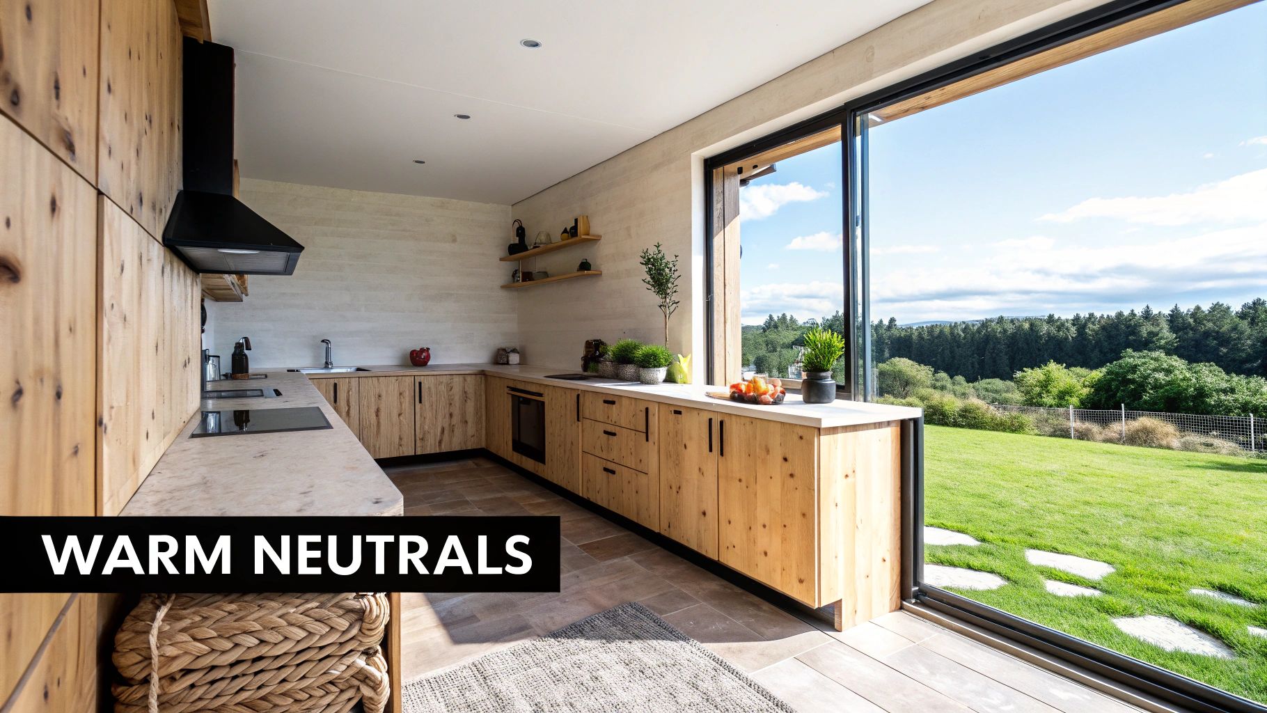
This isn’t just a passing fad; it’s a reflection of how we want to feel in our homes. A kitchen decked out in warm neutrals feels less like a sterile workspace and more like the true heart of the house. Think of these colors as a design-forward comfort blanket, wrapping the room in a gentle, welcoming glow.
The magic of earthy neutrals is their connection to the natural world. Hues like mushroom, sand, and clay bring a sense of calm and stability, creating an environment that helps you unwind from a hectic day. It’s this psychological comfort that’s really driving their popularity.
On top of that, these shades are incredibly versatile, providing a timeless foundation that fits almost any design style.
For renovators and property flippers, this trend is a smart, sophisticated bet. These colors have broad appeal, making a property feel updated and high-end without the risk of alienating potential buyers. They add lasting value by creating an atmosphere that feels both current and classic.
Explore our full range of kitchen cabinet styles and colors to find the perfect shade for your project.
To give you a clearer picture, here’s a quick breakdown of the neutral cabinet colors dominating the scene right now.
These colors offer a fantastic starting point for any kitchen project, whether you’re aiming for subtle elegance or a warm, modern vibe.
Don't just take our word for it—the data backs it up. A remarkable 96% of designers now point to shades like mushroom, taupe, and creamy whites as their top picks for kitchen cabinets. This overwhelming consensus shows a clear market direction, leaving colder tones behind for palettes that offer more depth and comfort.
Key Takeaway: Choosing a warm neutral is more than a style choice—it's a strategic move that lines up with what buyers want and creates a truly restorative atmosphere. These colors provide a flexible canvas that lets your hardware, countertops, and backsplash really pop.
Ultimately, the turn toward warm neutrals is about creating kitchens that aren't just beautiful, but also feel good to be in. They're welcoming, adaptable, and built to last, making them a smart investment for any home.
While warm, earthy tones have long been a go-to for creating a cozy kitchen, another major player has completely changed the game. Blues and greens are stepping up, redefining what a “neutral” can even be.
Once saved for an accent wall or a pop of color on an island, these nature-inspired shades are now taking center stage as primary cabinet colors. They bring a sense of calm and sophistication that feels both timeless and perfectly on-trend.
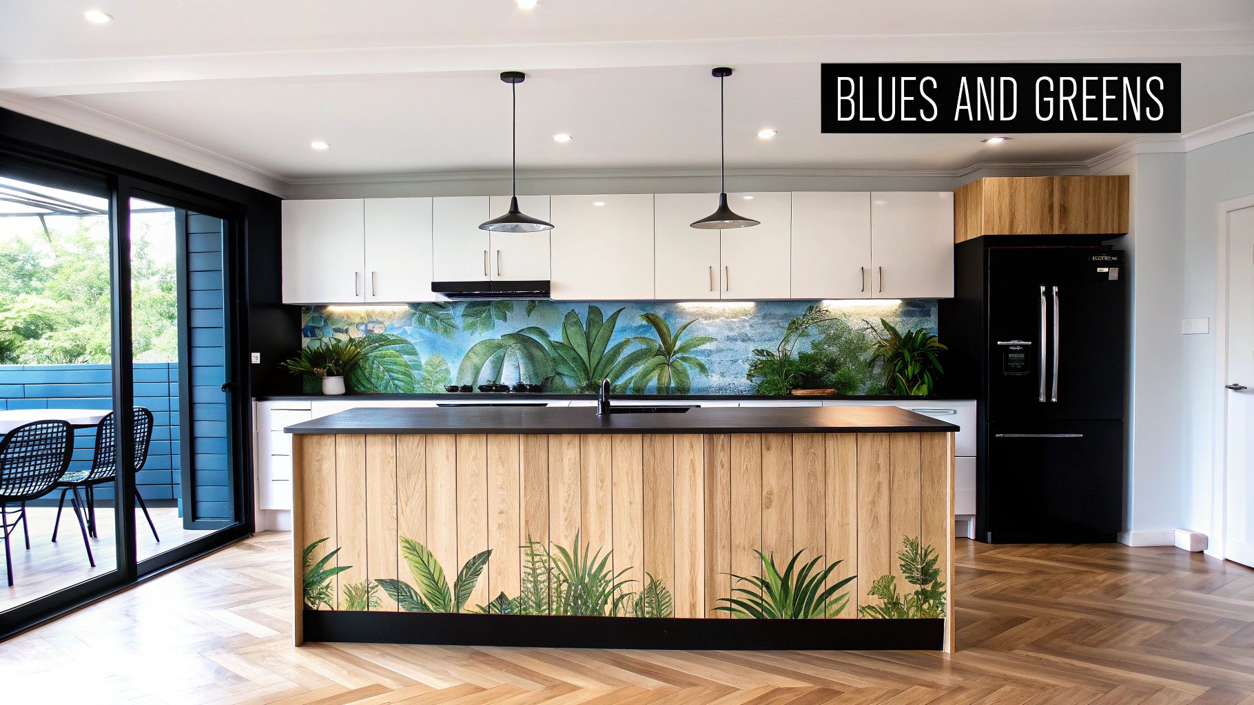
Think of it like this: a great pair of blue jeans goes with almost anything in your wardrobe. Blue and green cabinets have that same chameleon-like quality in a kitchen. They can feel bold and dramatic or soft and serene, all depending on the specific shade and what you pair it with. This versatility is why so many designers are calling them the new neutrals.
The best part of this trend is its incredible range. You aren’t stuck with just one shade of blue or green. Instead, you can find the perfect hue to match the exact mood you want to create, which is a key part of the latest kitchen cabinet color trends.
This trend generally splits into two popular directions:
This ability to swing from dramatic to serene makes blues and greens an incredibly powerful tool for any kitchen renovation.
Bringing these colors into your kitchen doesn’t have to be an all-or-nothing commitment. There are several smart ways to incorporate the trend for a high-end, custom look without overwhelming the space. The key is to think strategically.
Pro Tip: A kitchen island painted in a rich navy or deep forest green instantly becomes the room's centerpiece. It draws the eye and adds a sophisticated layer of visual interest while letting you keep the rest of your cabinets in a safer, more traditional neutral.
Another popular approach is using color to define different zones. Painting just the lower cabinets a moody blue while keeping the uppers a crisp white is a classic two-tone look. This technique grounds the space, adds character, and can even help the room feel taller and more open.
Of course, if you’re ready to fully commit, using a single beautiful shade of green or blue across all your cabinetry creates a truly immersive and cohesive design statement that’s sure to impress.
The two-tone kitchen isn't just a fleeting trend; it’s a powerful design strategy that brings depth, personality, and a custom-built feel to your space. The idea is simple but the impact is huge: using two different cabinet colors instantly creates visual intrigue and keeps a kitchen from feeling flat or one-dimensional. It's a go-to trick for designers, and for very good reason.
The most popular way to pull this off is by pairing lighter upper cabinets with darker base cabinets. This method is pure visual genius. The darker lower cabinets ground the room, giving it a solid, substantial feel. At the same time, the lighter uppers draw your eyes upward, making the ceiling seem higher and the whole kitchen feel more open and bright.
While you can get creative, a few combinations have become true classics in kitchen design. They deliver that high-end look that almost everyone loves, making them a smart and stylish bet for any renovation or property flip.
Here are a few high-impact duos to consider:
Investor Insight: For anyone upgrading a property, a two-tone kitchen is a strategic play. It takes the kitchen from "builder-grade" to "custom-designed," often for little to no extra cost. That jump in perceived value can make a huge difference to buyers.
A two-tone layout also gives you the freedom to use a bolder color you love—like a deep forest green or a striking blue—without letting it take over the entire room. It’s the perfect balance of personality and timeless appeal, ensuring your kitchen looks amazing for years to come.
Picking the perfect cabinet color is a huge win, but your beautiful kitchen isn't quite finished yet. Your cabinets are the main event, but the hardware and countertops are the accessories that pull the entire look together. Getting these pairings right creates that polished, cohesive feel you see in design magazines. The wrong combo? It can make even the most beautiful cabinet color feel a little off.
This is where a good design really shines—it’s all about creating a conversation between the different colors, textures, and materials in the room. Think about how the warmth of brushed brass hardware can pull out the deep, moody tones in a dark green or navy blue cabinet, making the color feel even richer.
On the flip side, sharp matte black hardware creates a bold, graphic contrast against a soft white or warm greige cabinet. It's a simple swap that can instantly shift the kitchen's vibe from cozy and traditional to sleek and contemporary.
As the largest horizontal surface in your kitchen, your countertops have a huge impact. Their relationship with your cabinet color is absolutely critical. The key is to find a countertop that either complements your cabinets or provides a thoughtful, intentional contrast. You never want them fighting for the spotlight.
A few simple strategies can help guide you:
This diagram shows a popular and effective way to balance light and dark elements for a dynamic kitchen design.
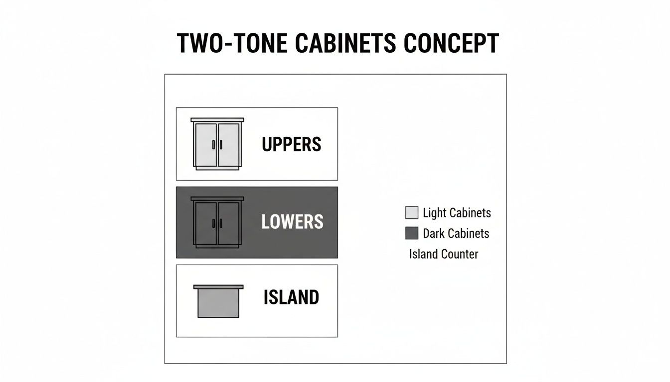
This illustrates the two-tone concept, a great strategy for adding visual depth by using lighter upper cabinets with darker lowers or a standout island.
They call hardware the "jewelry" of the kitchen, and it’s true. It's a small detail that makes a massive difference in the final look and is a huge part of today's kitchen cabinet color trends.
Key Insight: The finish of your hardware should match the overall feeling you want to create. Warm metals like brass, bronze, and copper add a timeless, elegant touch. Cool metals like chrome and nickel feel more crisp and modern. And of course, black and stainless steel are the versatile workhorses that fit almost any style.
Here’s a quick guide to some no-fail hardware pairings:
At the end of the day, a cohesive design is all about balance. Every single choice—from the cabinet color and countertop material to the hardware finish—should work together to support your overall vision.
The perfect cabinet color isn’t just about what you like; it’s a strategic choice that needs to align with your end game. Are you flipping a property for a quick profit, designing a one-of-a-kind dream home, or renovating a kitchen you plan to love for years? The right color makes all the difference, and your goal should be the number one thing guiding your decision.
Think of it like choosing an outfit. You wouldn't wear a tuxedo to a backyard barbecue. In the same way, your cabinet color needs to be dressed for the occasion—whether that’s a fast sale, a unique design statement, or your own long-term enjoyment.
When you’re flipping a house, the mission is simple: maximize your return on investment. This means picking colors that appeal to the widest possible audience. You’re not designing for yourself; you're creating a bright, welcoming canvas that helps buyers instantly imagine their own lives unfolding there.
Your best friends in this scenario are warm off-whites, light grays, and soft greiges. There’s a good reason these colors dominate modern kitchen trends.
ROI Insight: Sticking with these proven neutrals is your safest and most profitable bet. They make spaces feel bigger, cleaner, and move-in ready—all key selling points that can seriously speed up a sale.
If you're crafting a signature space for a client or for yourself, your creative options blow wide open. This is where you get to make a statement and design a kitchen with real personality. Bold, saturated colors become your best tools for creating an atmosphere that’s truly unforgettable.
Think about deep forest greens or rich navy blues. These colors instantly establish a mood of luxury and sophistication, turning the kitchen into the home's stunning centerpiece. You can go all-in and use them on every cabinet or make them a grounding force on a large central island. The goal here isn't mass-market appeal; it's about creating a unique, curated vibe that tells a specific story.
When you’re tackling a renovation in your own home, the main goal is your own long-term happiness. You need a color you'll still love looking at years from now, not something that will feel dated by next season. The trick is to strike that perfect balance between what’s on-trend right now and what has timeless style.
Look at colors that are popular but have classic roots, like a calming sage green or a dusty, muted blue. These hues have more personality than a standard neutral but are subtle enough to stay fresh and relevant for the long haul. They create a beautiful backdrop that you can easily update over the years with new hardware, decor, or a different backsplash tile. This approach makes sure your investment pays off with a kitchen you’ll enjoy for a long, long time.
Getting inspired by the latest cabinet color trends is the fun part. Now, how do you get from that spark of an idea to a finished kitchen you'll love for years to come?
It’s actually more straightforward than you might think. We’ve walked through the warm neutrals, the beautiful blues and greens, and even some clever two-tone layouts. The next logical step is to see how those ideas translate from a screen into your home. Making that vision tangible is the key to a confident remodel.
Let's cut through the guesswork and get straight to a plan. Seeing your ideas come to life before committing is the single best way to ensure the cabinet style and color you choose are a perfect match for your space.
Here’s a simple path forward:
Visualize Your Space: The best way to finalize your choice is to see it first. We offer a free 3D design service that shows you exactly how different cabinet colors will look in your kitchen's unique layout. Just send us your measurements, and our design team will build a detailed rendering and a no-obligation quote.
Order Door Samples: You’ve got to see colors in your own light. A computer screen can only do so much. Ordering physical door samples lets you feel the finish and see how the color truly looks next to your flooring, countertops, and wall paint throughout the day.
Finalize and Order: Once you've perfected the design and confirmed your color choice with samples, you’re ready to move forward. Our ready-to-assemble cabinets ship fast, keeping your project on track without the long lead times common elsewhere.
The most important step is the one you take right now. Don't let a great idea stay an idea. A free design and a few samples are all it takes to start building the kitchen you’ve been dreaming of.
This direct approach helps you avoid those common renovation regrets. By following these steps, you can start your project with a crystal-clear direction and the right materials, setting yourself up for a smooth and successful kitchen transformation.
If you're thinking about resale value, warm neutrals are a consistently safe bet. Colors like off-white, greige, and light gray appeal to the widest audience of potential homebuyers, creating a bright, clean slate. These shades make it easy for new owners to picture their own style in the kitchen without immediately thinking about a remodel.
Not at all. White kitchen cabinets are a timeless classic, but the trend is definitely leaning away from stark, clinical whites toward warmer, creamier tones. A classic white shaker cabinet will always look great and brighten up a kitchen. The secret to keeping it fresh is in the details—think modern hardware or a bold, contrasting island to make it pop.
Key Takeaway: White isn't going anywhere; it's a solid foundation. The shift is simply toward warmer undertones that create a more inviting and comfortable atmosphere.
For smaller kitchens, light and bright is almost always the right move. Lighter shades like a classic White, a soft Dove, or a light Grey are fantastic because they reflect light, which instantly makes the room feel bigger and more open. To maximize the effect, use the same light color for both your upper and lower cabinets to create a clean, seamless look that expands the sense of space.
Ready to see how these cabinet colors could transform your own kitchen? Cabinets4sure, Inc. offers a free 3D kitchen design to help you visualize the final look. Check out our full collection and get your project started at https://www.cabinets4sure.com.